UI Design for SaaS Products: Make the Next Action Clear
Design SaaS dashboards and workflows around user decisions, meaningful states and consistent components rather than decorative complexity.
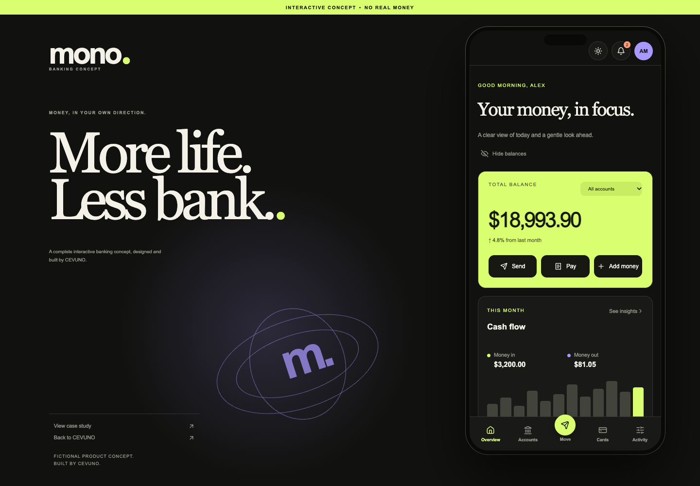
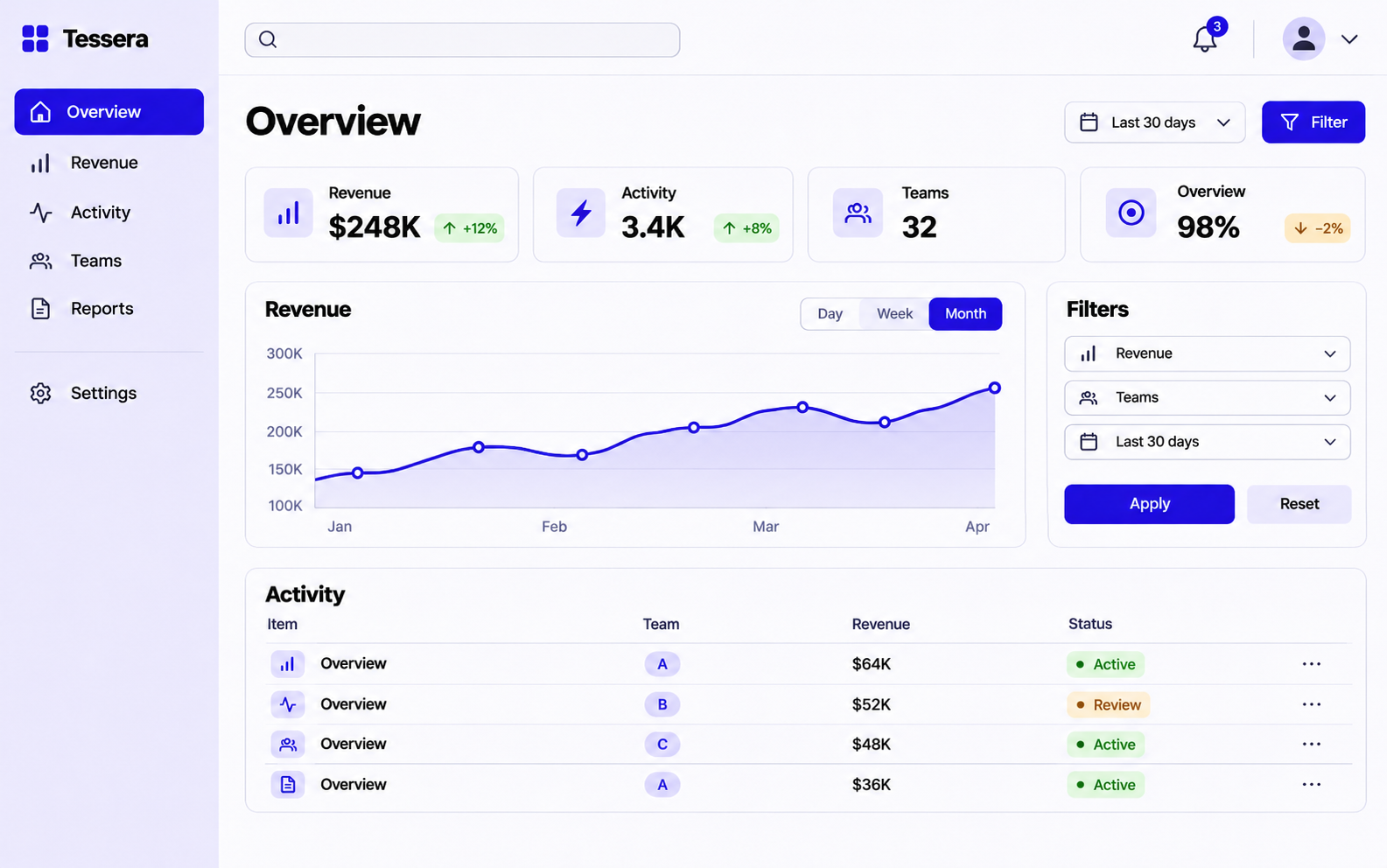
A SaaS interface helps someone accomplish work. The visual hierarchy should make the next useful action easier to identify, especially when the product contains dense information or repeated tasks. For an agency designing a new dashboard, the challenge is to make the system understandable without making every screen look empty or oversimplified.
Design around tasks instead of a feature inventory
Identify the few tasks that bring people into the product repeatedly. A project manager may need to review overdue tasks, assign an owner and confirm a status. Those actions should shape the first screen more than an ambition to display every available feature.
Group information by the decisions it supports. A large metric is useful only when the reader understands its period, meaning and next step. Avoid creating charts whose visual variety exceeds their informational value.
Treat states as part of the product
A finished interface includes more than the ideal populated screen. Empty, loading, validation, permission and error states explain how the product behaves when information is missing or an action cannot complete. These are important design decisions, not optional polish.
Use realistic sample content to assess long labels, unusual amounts and incomplete records. Fictional demonstration data should be labelled honestly, particularly in financial or operational concepts.
Create a coherent component language
Tables, filters, side panels, dialogs and action buttons should follow recognisable rules. Consistency reduces the number of new patterns someone needs to learn as they move through the product. Document keyboard behaviour and responsive priorities alongside appearance.
CEVUNO can support SaaS interface design and frontend production, including dashboards and reusable components. Bring the core user tasks, expected data and technical constraints so the first scope targets a useful product slice.
Distinguish an overview from an operating workspace
An executive dashboard and an operational dashboard serve different purposes. An executive may need a small set of indicators and trends. An operator may need a queue of records, exceptions and actions. Combining both without priorities often produces a busy screen whose cards compete for attention.
For SaaS UI design, write the key tasks before choosing charts. If the user’s job is to resolve overdue invoices, a clear list with status and next actions may be more useful than a large decorative revenue graph. The best format is the one that supports the decision, even if it looks less impressive in a thumbnail.
Design with a realistic data contract
Ask which fields actually exist, which can be missing and which update asynchronously. A design showing an instant summary of five systems may imply backend work that has not been planned. Work with realistic sample records and mark invented values as demonstration data during concept review.
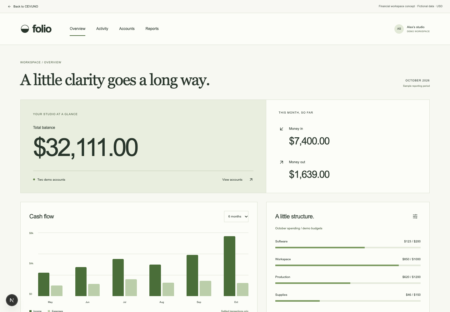
Define formatting rules for dates, amounts and statuses. A balance without a currency, a chart without a time period or a percentage without context leaves interpretation to the user. The interface should explain the data well enough for the task without relying on a stakeholder to narrate the screen.
Model the uncomfortable states
Products spend time loading, saving, waiting for permission and recovering from failure. Show what happens if a user opens an empty account, loses access to a record or attempts a duplicate action. These states expose decisions about workflow that a populated dashboard does not reveal.
For destructive actions, decide what can be undone and how consequences are explained. For long operations, decide how progress and completion are communicated. These are product requirements; adding a generic spinner to every unresolved screen is not a complete interaction design.
- Empty: explain what belongs here and how to begin.
- Loading: preserve a useful sense of context.
- Error: describe the problem and a realistic recovery route.
- Permission: explain the boundary without exposing restricted information.
- Success: confirm the action and show the next useful step.
Prioritise the first usable product slice
Instead of designing every screen to the same superficial depth, choose one important flow and cover it fully. A searchable record list, detail page, edit form and confirmation may provide a stronger foundation than twelve disconnected dashboard concepts. Review the flow against the data contract and role permissions before expanding it.
CEVUNO can support the interface and frontend portions of that work. Product research, backend design and user recruitment should be separately assigned if required. A bounded product slice gives your agency a practical way to evaluate the design language and implementation before committing to a broader roadmap.
Review a task with the actual user role
An administrator, operator and viewer may see similar data but have different permissions. Before finalising the interface, check which actions each role can take and how unavailable actions are represented. A design that exposes every control to every role can imply a permissions model the product does not support.
Use an illustrative scenario to review the flow: an operator finds an overdue record, inspects the context, changes an allowed field and confirms the save. Ask where the user needs more explanation, where an action could be repeated accidentally and what happens if the record changes elsewhere. These questions help turn dashboard UI design into a usable product flow.
Choose the right first deliverable for a product engagement
If the product direction is uncertain, a flow map and a few representative screens may be more useful than an entire polished application. If the workflow is established, a component-led implementation can address consistency and production speed. The brief should identify the stage of the product so the partner can propose an appropriate contribution.
Do not assume UI production includes user research, market validation or backend architecture. Those activities can be important, but they need owners and a scope. CEVUNO can support interface and frontend production around the information your agency supplies, with unresolved product questions made visible before they become implementation assumptions.
Explore CEVUNO’s design, development and creative services or browse the portfolio concepts to see the type of production we can discuss with your agency.
Make room for your next project.
Tell us what your agency needs to produce. We’ll review the scope, estimate the work and confirm availability together. Monthly partnerships and one-time projects are available.