React Component Development for Agency Design Systems
Scope reusable React components around states, behaviour, content flexibility and documentation so they remain useful across real screens.
A reusable React component is more than a visual fragment moved into a separate file. It needs a clear purpose, sensible inputs and predictable behaviour across the places where it appears. For an agency, a well-scoped component foundation can help new screens stay consistent without forcing every client requirement into a single overly complicated abstraction.
Define the component’s job
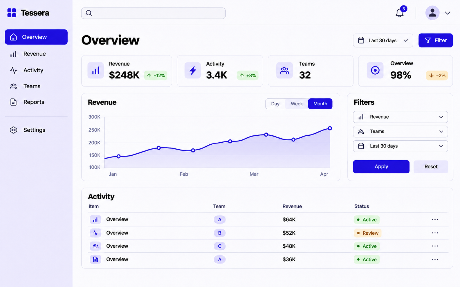
Start with patterns that repeat in the actual product: fields, buttons, navigation, cards and feedback messages. Decide which variations represent genuine needs. A component that exposes dozens of arbitrary switches can become harder to understand than a small group of related patterns.
Use real content during development. A card should handle a long title, a missing image and a secondary action if those situations belong in the product. Avoid designing the API around a single ideal screenshot.
Specify behaviour alongside appearance
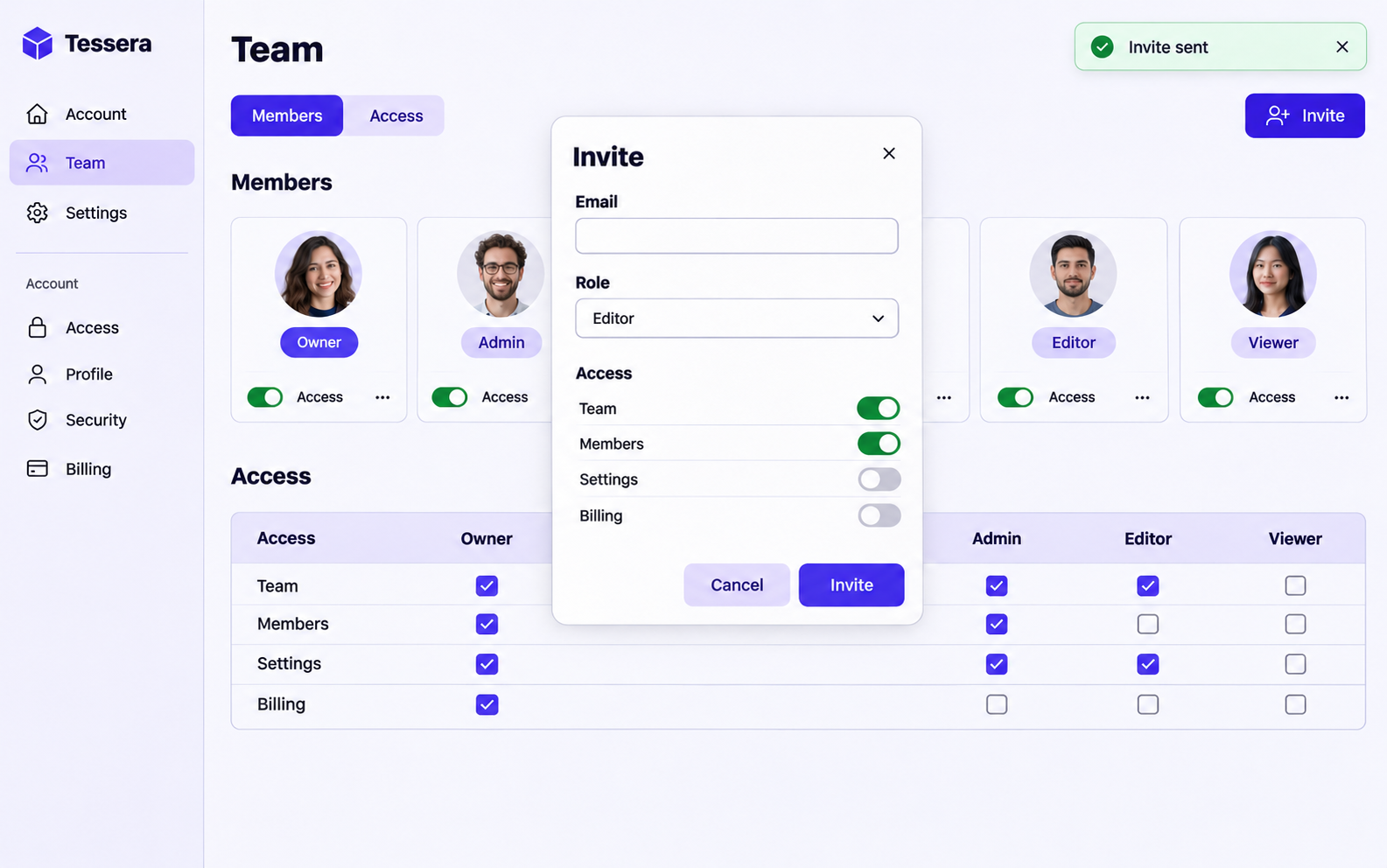
Interactive components need clear state and keyboard behaviour. A dialog needs a way to open and close, focus handling and an understandable name. A form field needs a label, useful validation feedback and appropriate disabled or loading behaviour.
Agree the relationship with existing design tokens and layout rules. Reusable components are easier to maintain when they share spacing, type and colour decisions rather than embedding slightly different values everywhere.
Deliver examples that support future use
Include representative usage examples and document the important variations. The next developer should be able to tell when a component is appropriate and when to compose a new pattern. Review the implementation in the context of a real page before declaring the foundation complete.
CEVUNO can help agencies build React interface components from approved designs or an existing system. A useful first scope is a contained component batch with state coverage and a representative screen that proves how the pieces fit together.
Begin with the component hierarchy
React’s official guidance describes breaking an interface into components and then identifying the state needed to support interaction. For an agency project, this is also a scoping exercise. A searchable list can be separated into filters, results and individual items, while the ownership of shared values must remain understandable.
The objective is not to turn every line of markup into a component. Extract a pattern when it has a clear responsibility, repeated use or behaviour worth containing. Excessive abstraction can make a simple page harder to change, while duplicated interactive logic can make fixes inconsistent.
Distinguish variation from a different responsibility
A button may have a primary and secondary visual treatment while remaining the same kind of control. A navigation link and a submit action have different responsibilities even if they look similar. An API that treats every control as a shape with arbitrary behaviour can make semantic errors easier to introduce.
For component library development, ask what the consumer is allowed to configure and what should remain consistent. If every screen can override colours, padding and interaction behaviour independently, the library may preserve little of the design system. Provide purposeful variants with documented examples instead.
Test the component through a realistic composition
A field component can look correct alone and still behave poorly in a complex form. Check labels, helper text, validation feedback and focus order in the actual composition. A card should handle the longest realistic title and the actions the product needs, rather than only the shortest demo content.
Interactive examples should show controlled values, loading and error conditions when they are part of the component’s job. Tests are most useful when they protect meaningful behaviour or a bug-prone boundary, rather than repeating the component’s markup in assertion form.
Leave the next developer a usable vocabulary
Document how to choose between variants and where composition is preferred. Include a representative screen that demonstrates the intended spacing and layout context. The next developer should not have to discover the correct combination of props by copying an unrelated page.
CEVUNO can support React UI development from approved designs or an existing system. Define the component batch and the product flow that will use it. That combination helps the agency assess both reusable foundations and their practical value in the interface.
Explore CEVUNO’s design, development and creative services or browse the portfolio concepts to see the type of production we can discuss with your agency.
Make room for your next project.
Tell us what your agency needs to produce. We’ll review the scope, estimate the work and confirm availability together. Monthly partnerships and one-time projects are available.