Responsive Website Design: More Than a Smaller Desktop Layout
Understand the responsive design decisions behind readable content, usable navigation and flexible interfaces across screen sizes.
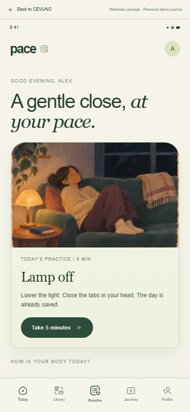
A responsive website adapts the experience to the available space. Shrinking a desktop composition is rarely enough: navigation, image crops, content order and interactive elements may all need a different treatment. For agencies, making these decisions during design helps frontend production avoid improvising critical parts of the experience at the end.
Start with content priorities
Ask what visitors need first when space becomes limited. A complex hero may simplify, a comparison table may need a scrollable container and a navigation bar may become a menu. The information should remain available even when its presentation changes.
Write real headings and realistic body copy before assessing the layout. Short placeholder text hides the wrapping and overflow problems that appear once a client supplies a long service name or a detailed explanation.
Design interactions for different inputs
A desktop hover treatment cannot be the only way to reveal important information. Consider touch, keyboard navigation, visible focus and a menu that can be opened and dismissed predictably. Forms need persistent labels and understandable error messages at every width.
Images should support the composition without pushing the main content out of reach. Decide whether a visual can crop safely, needs a mobile alternative or should be displayed in full.
Review between the reference screens
Desktop and mobile mockups are reference points, not the only widths the browser will encounter. Test intermediate layouts, long content and zoom. A system based on flexible containers and sensible wrapping usually holds together better than a collection of fixed positions.
CEVUNO approaches responsive design and frontend work as connected tasks. If your agency already has desktop Figma files, include mobile priorities and interaction expectations in the brief so the adaptation can be estimated rather than assumed.
Choose breakpoints when the content needs them
Responsive UI design is not a list of popular phone sizes. A navigation bar should change when its labels and controls no longer fit comfortably. A card grid should reduce columns when the available width makes the cards difficult to read. Use reference devices during review, but let the content reveal where a layout needs to adapt.
For example, a six-item agency menu may fit at one width until the client adds a seventh label or translates a service name. Flexible spacing can absorb small changes, but there is a point where a different navigation pattern is clearer. Document that behaviour instead of reducing the text until it technically fits.
Design images and dense information deliberately
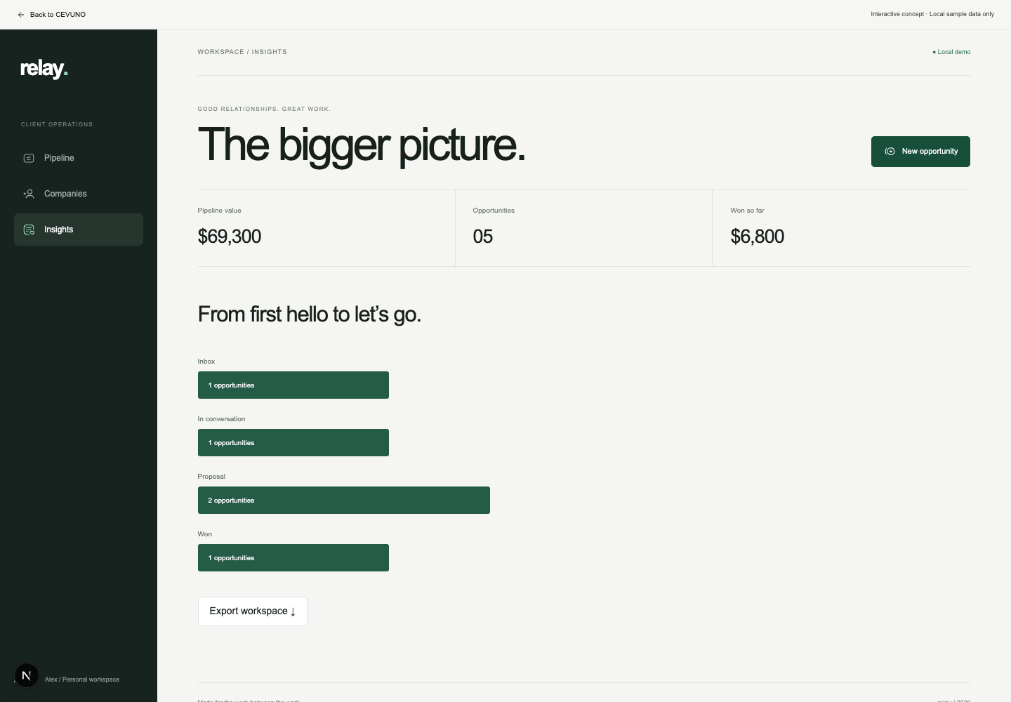
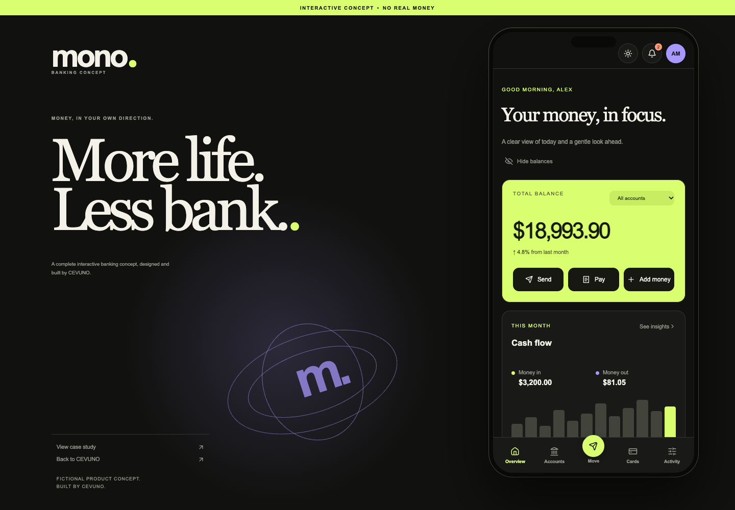
A wide photographic crop may work on desktop while removing the subject on mobile. Agree a focal point or use a different crop when the image needs it. Interface screenshots present a different problem: shrinking a complete dashboard can make its text unreadable. Sometimes a selected detail communicates the idea better than the whole screen.
Tables need a clear responsive approach too. A pricing comparison might become a set of grouped cards, while an operational data table may need horizontal scrolling with its meaning preserved. The choice depends on how people compare the information, not simply which layout is easiest to code.
Review real text and alternative input methods
Test long headings, multi-line buttons, missing images and validation messages. Check what happens when the visitor zooms or increases text size. A page can pass a narrow-width screenshot check yet still become difficult to use when its content grows. This is why responsive web design services should include content resilience, not only device mockups.
A mobile-friendly website must also support more than touch. Keyboard users need a sensible focus order and visible controls. Hover-only instructions should have another route. Ask the production partner to show how the same task works across layout and input changes, then record any limitations before release.
Explore CEVUNO’s design, development and creative services or browse the portfolio concepts to see the type of production we can discuss with your agency.
Make room for your next project.
Tell us what your agency needs to produce. We’ll review the scope, estimate the work and confirm availability together. Monthly partnerships and one-time projects are available.