Aura.
A softer side of everyday.
Explore the design and frontend execution in a complete, navigable experience.
A softer side of everyday.
A considered commerce concept for a fictional skincare label, pairing warm editorial storytelling with a clear product discovery experience.
Every detail,
with intention.
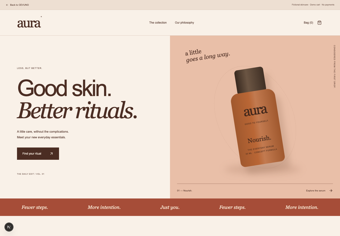
Soft peach, burnt orange, and oversized serif typography balance tactility with digital clarity. Original product studies put packaging at the centre of the story.
- Storefront design concept
- Product page direction
- Original packaging illustrations
- Responsive compositions
An interactive concept with fictional content and local demo data. It does not process real purchases, payments, or messages.
How the concept
came together.
We explored how editorial storytelling and clear product discovery can share one warm visual language.
- 01
Find the warmth
Skincare is trust. Soft peach, burnt orange, and serif type read like a well-made label rather than a sales pitch.
- 02
Draw the products
Four original packaging studies — Nourish, Restore, Reset, Shelter — anchor the store, so commerce feels like a shelf, not a spreadsheet.
- 03
Compose the commerce
Storefront, product pages, and a calm purchase path are built as one responsive system: tactile, but never fussy.
Interface composition and visual language.
Original CEVUNO concept study.
From a concept
to a working experience.
An editorial commerce concept with fictional products, an editable bag, and a local order preview. No purchases are processed.
Explore live demoInside the demo
- Product collection with filters and sorting
- Four product pages and size selection
- Persistent bag with quantities and removal
- Local order preview
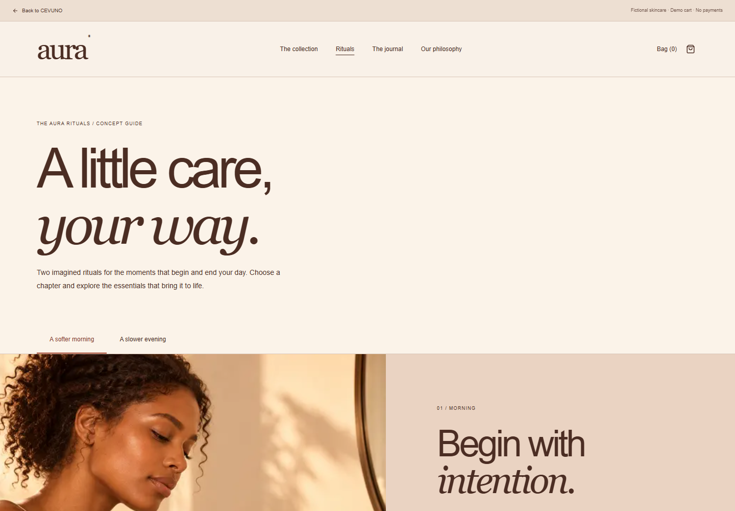
- Morning and evening ritual selector
- AI-generated editorial ritual imagery alongside original packaging illustrations
- Ritual guide, journal, and an editorial story
Built with